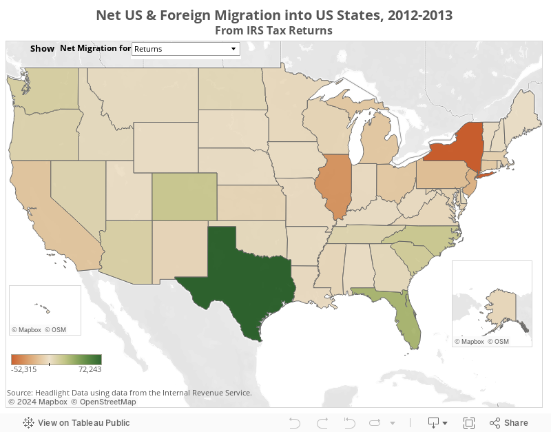
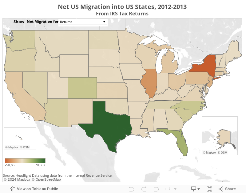
INTERACTIVE MAP: Total Net US & Foreign Migration into US States, 2012-2013
These maps show total net migration into individual US states from 2012-2013 based on IRS tax return data. Migration can be measured in terms of total returns, total exemptions, and total gross income. Net Migration is measured as the difference between in-migration into the state and out-migration from the state. Maps show Net US & Foreign Migration or just intra-US Migration.
Select a metric to see net migration flows for that state. Float your cursor over a state to see the actual value.
Permission is granted to embed this map in any website. Click the "Share" button to get the embed code.