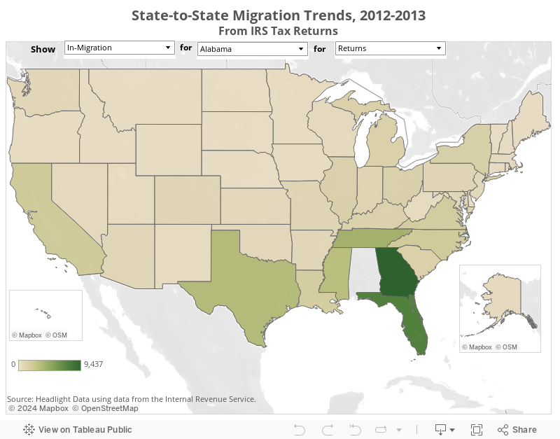
INTERACTIVE MAP: State-to-State Migration 2012-2013
This map shows migration trends between states from 2012-2013 based on IRS tax return data. Migration can be measured in terms of total returns, total exemptions, and total gross income. Migration flows are shown as total in-migration, total out-migration, and total net migration (the difference between in- and out-migration).
Select a flow, then a state, then a metric to see flows for that state.
Permission is granted to embed this map in any website. Click the "Share" button to get the embed code.