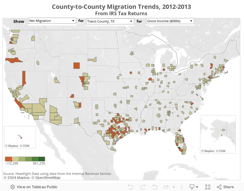
09 Sep 2015 INTERACTIVE MAP: County-to-County Migration 2012-2013
This map shows migration trends between counties from 2012-2013 based on IRS tax return data. Migration can be measured in terms of total returns, total exemptions, and total gross income. Migration flows are shown as total in-migration, total out-migration, and total net migration (the difference between in- and out-migration).
Select a flow, then a county, then a metric to see flows for that county.
Previous Post
Counties Attracting Most New Taxpayer Income in 2013 Are in Austin-TX, Miami-FL, Naples-FL, Phoenix-AZ, and Las Vegas-NV; Counties in Los Angeles, Chicago, and New York City Lose Most Income
Recently released data from the Internal Revenue Service shows that county-to-county net migration (total in-migrants ... Read more
Next Post
INTERACTIVE MAP: Total Net Migration into US Counties, 2012-2013
This map shows total net migration into individual US counties from 2012-2013 based on IRS ... Read more